- Landscaping Websites
- Cleaning Websites
- Flooring Websites
- Tailor Websites
- Plumbing Websites
- Car Dealer Websites
- Funeral Websites
- Trucking Websites
- Logistics Websites
- Notary Websites
- Financial Advisor Websites
- Digital Agency Websites
- Real Estate Agent Websites
- Insurance Agent Websites
- Gym Websites
- Wellness Websites
- Hair Salon Websites
- Chiropractic Websites
- Dog Grooming Websites
- Travel Websites
- Hotel Websites
- Museum Websites
- Theater Websites
- Art Gallery Websites
- SaaS Websites
- Startup Websites
- Nonprofit Websites
- Technology Websites
- University Websites
- UX Designer Portfolios
- Web Developer Portfolios
- Student Portfolio
- Model Websites
- Art Portfolios
- Marketing Portfolios
- Squarespace Portfolios
- Copywriter Portfolios
- Interior Designer Portfolio
- Wix Ecommerce Examples
- Squarespace Ecommerce Examples
- Shopify Ecommerce Examples
- Wix Websites
- Webflow Examples
- Thinkific Examples
- BigCommerce Examples
- Kajabi Examples
- Duda Examples
- Zyro Examples
- Bluehost Websites
- ClickFunnels Examples
- Weebly Websites
- Blog Examples
- Wix Blog Examples
- Squarespace Blog Examples
- Lifestyle Blog Examples
- Food Blog Examples
- Travel Blog Examples

26 Great Education Website Examples For 2024
Statista shows that the global e-learning market will reach $400 billion by 2026. You don’t need to be an expert to know that the traditional classroom educational system is declining while the online education market is booming.
Smart educationists have top-notch websites that speak to their target audiences on a personal level and get them to trust their services.
You can use the best website builders like Squarespace and Wix which offer website-building tools and custom educational website templates to design unique sites.
This article checks out the 26 most inspiring educational websites with amazing designs you can copy or use as inspiration when building yours.
Let’s get started.
1. Ross School
Made with Squarespace
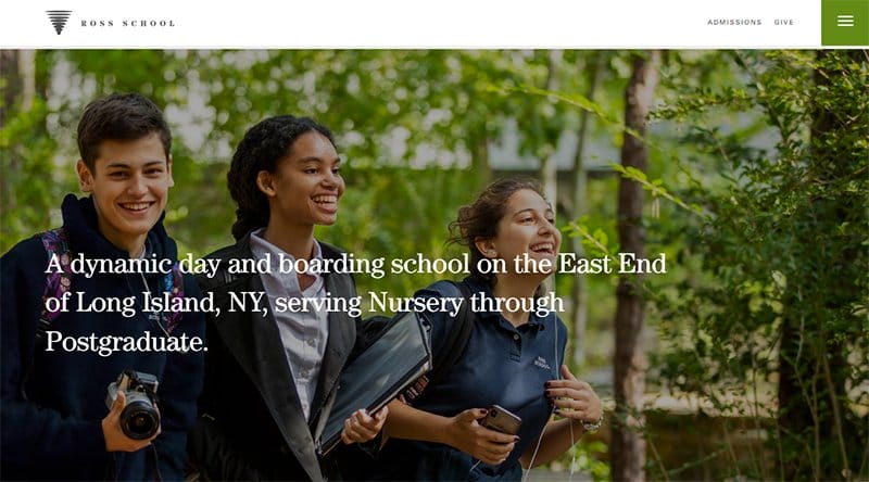
Ross School is a boarding school based in Long Island, New York that focuses on fostering interdisciplinary, integrated thinking, and innovative leadership and facilitating lifelong learning.
I like how the first catchy element is a stunning image of students carrying books and other devices with wide smiles on their faces.
The white-colored sticky navigation bar with a hamburger feature is your one-stop shop for exploring various aspects of the page and taking action.
Interested visitors can feast on the heartwarming content in the student and alumni testimonials section which serves as social proof.
2. CanDo Kiddo
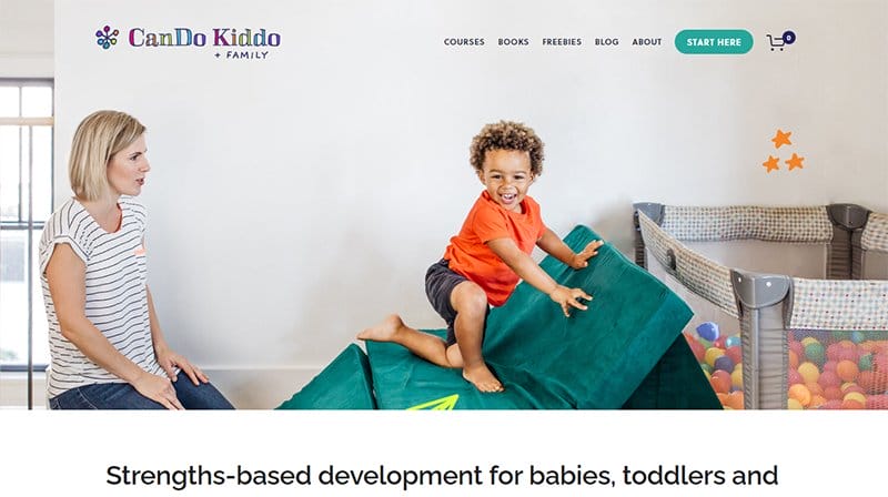
CanDo Kiddo is the brainchild of Racheal, a professional pediatric Occupational Therapist with over 14 years of experience.
This educational website doubles as an online store that parents and online visitors can access by clicking the shop icon on the mega navigation bar.
I like how the website features an informative zig-zag design layout displaying the various stages of the course and a child's development.
The bio section features engaging content about Rachel like her passion for supporting whole family development regarding their bodies, minds, and relationships.
3. Seascape Private School
Made with Wix
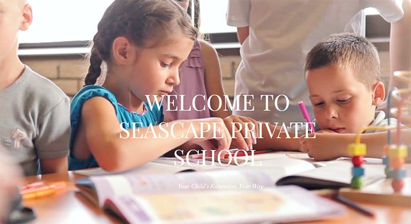
Seascape Private School Is a private school with the flexibility of homeschooling from the safety and comfort of home. Welcoming visitors to the site is an image of kids learning with full concentration and having fun in the learning process.
Beneath the homepage is highly informative content about the school. At the end right side of the page is a pinned chat button feature to reach out to the school for further inquiry.
The last section has a short video of a happy family having fun. Interested visitors can click the social media icons to check out premium content on the school’s online profile.
4. St.Thomas More School
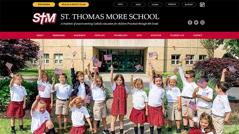
St. Thomas More integrates Christian living and academic pursuits in an endeavor to develop the whole child. Welcoming visitors to the site is a jaw-dropping slideshow that displays images of school children engaged in different activities.
This education site features a two-layer navigation header to help visitors with quick and easy access to website content. I like how the white background makes all the site’s elements like high-quality images and engaging texts visually appealing.
You can’t miss the parent testimonials section with a red background slide displaying comments to inspire visitors.
5. Cedar Hills
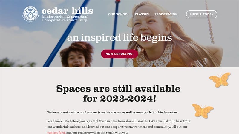
Cedar Hills Kindergarten & Preschool is a cooperative learning school in Portland. Welcoming visitors to the site is a half-width image of kids playing in the swing.
On the hero section is a visible red color CTA “Now Enrolling” button for visitors to enroll in the new section. This educational site features a parallax scrolling effect all through the page which makes its contents sync and visually appealing.
I love how both sections display content and images of Cedar Hills t eachers’ and parents’ testimonials to grab the attention of visitors.
6. Ready Steady Go
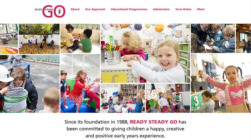
Ready Steady Go Is an early-year preschool that offers children a graduate program of care and education from 6 months until they join school.
Welcoming visitors to the site is multi-column layout images of kids learning and playing. The sticky white background menu contains the site logo which gives the page a personal touch.
Interested visitors can click on the sky blue search button on the white color footer for easy navigation of the site. This education site features a white background with the content written in black and red color.
7. Little Building Blocks
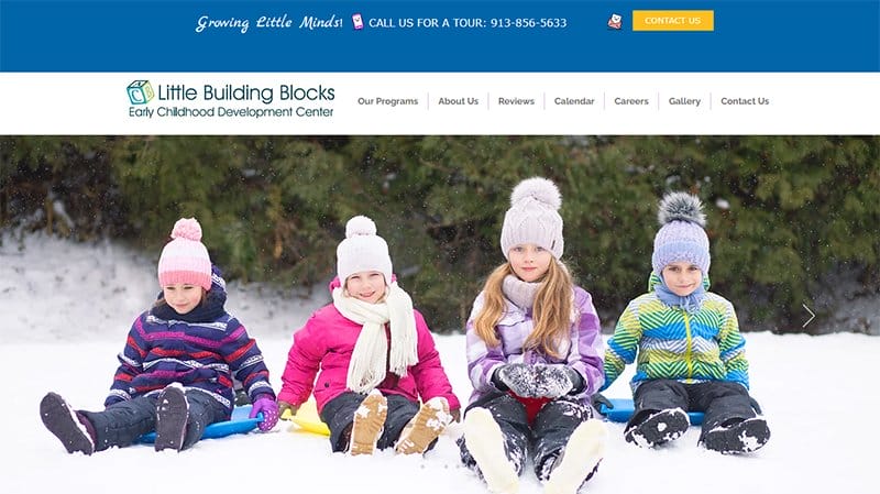
Little Building Blocks Is an early childhood center that focuses on providing a safe, fun, and nurturing space for all children. The first element on the site is a slider featuring images of kids playing and having the time of their lives.
I love how each section has the following features: images, a header, and informative content with a “Read More” button to explore further.
The page footer is on a blue background and features the school's address, social media icons, and a yellow CTA button.
8. Wonderful Education
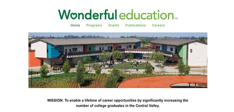
Wonderful Education website has a user-friendly interface with multiple outstanding features that give this great website a homely and fun feel.
This online education website welcomes visitors with a single-column grid layout of high-quality pictures of fun learning activities in the hero section.
The entire website has a white background that makes all the colorful design elements visible and appealing to potential customers.
Interested visitors and parents can check out the course content, services, and information about the school’s campus life via the drop-down navigation bar.
9. Ivy Stat
Made with Webflow
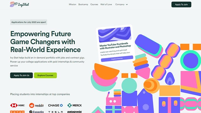
Ivy Stat has a simple design layout with various catchy elements like moving texts, vector illustrations, and engaging texts to give visitors a warm welcome.
Welcoming visitors to the outstanding education website is the caption “Empowering Future Game Changers with Real-World Experience ” written in bold text.
Interested visitors can click any of the two CTA buttons in the hero section to either explore the course content or join the initiative. The testimonial section features multiple heartwarming content from elementary and high school students who are beneficiaries of the platform.
10. Global Swiss Learning
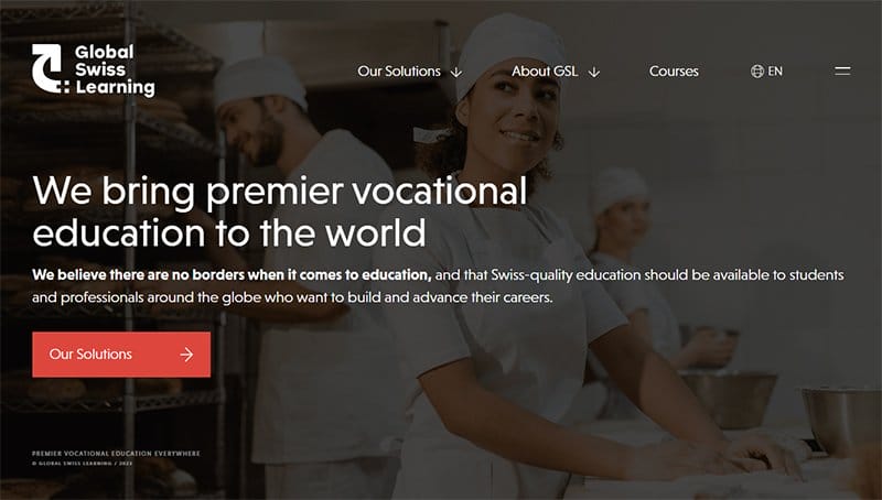
Global Swiss Learning’s website features a parallax scrolling effect that makes every element of this webpage sync and fun to explore. Visitors can use the hamburger navigation bar to move across pages.
Below the hero section is a catalog of logos of companies and schools that use Global Swiss Learning educational solutions which serves as social proof.
The white-colored site footer features vital information about this good education solution platform like contact details, blog links, and two social media icons.
11. YMCA Scouts DK
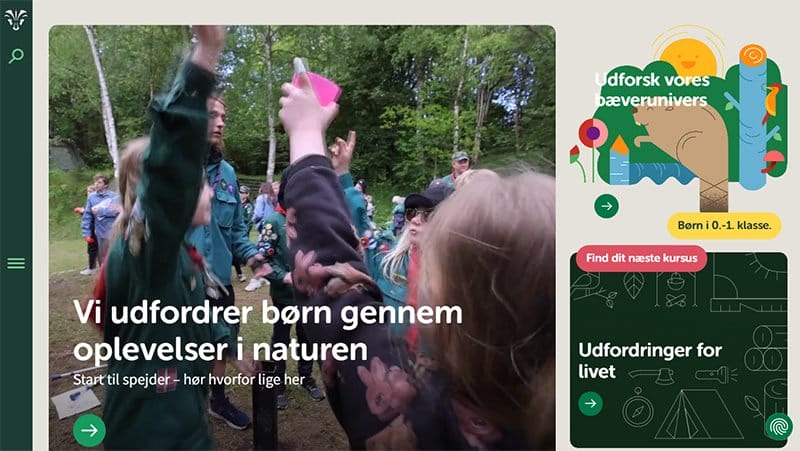
YMCA-Spejderne is a scout corps with around 27,000 members throughout Denmark. This education initiative focuses on helping young people become independent, honest, and responsible adults who respect their surroundings and nature.
The first catchy element that will pique your interest when you visit YMCA Scouts DK is an embedded video featuring various scout activities.
Parents can use the elements on the horizontal navigation bar to explore the site’s content without stress. These elements include a search function that is relevant for locating items and a hamburger menu that links to other pages.
Made with Unbo unce
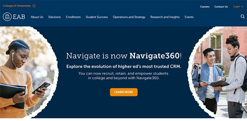
EAB works with over 2,500 institutions ranging from kindergarten, and college to career, to drive change through data-driven solutions.
This educational website has a colorful design featuring colors like deep blue, orange, and white as its dominant colors. I like how the website displays eye-catching elements like vector photos, high-resolution images, motion graphics, and engaging texts from top to bottom.
Navigation of the pages of this educational website is feasible for users via the blue-colored mega navigation bar at the top of the page.
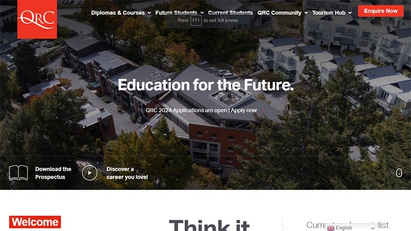
QRC is New Zealand’s premier school of Tourism, Business, and Technology that offers courses in adventure tourism, hospitality, and the tech aspect of the industry.
This university website welcomes visitors with an interesting video documentary of various heartwarming moments and other relevant school activities in the site’s hero section.
Clicking the larva red “ Enquire Now” CTA button at the top of the webpage is your one-way ticket to getting in-depth information about the school.
The black-colored site’s footer houses vital information about the institution like contact details, a newsletter column, and relevant social media icons.
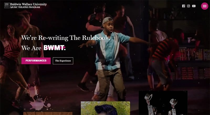
BWMT is a musical and dance-based university that offers various courses that help students reach their high potential in their passion for dance and music.
Purple, black, and white are the dominant colors which gives this educational site an elegant and sophisticated outlook resulting in a pleasant and memorable user experience. I like how the website features an embedded background video and multiple images in a slider format.
Interested visitors and parents can click any of the social media icons on the sticky navigation bar to explore more details about the school activities.
15. Learning Cubs
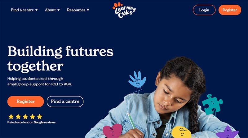
Learning Cubs’ website features a sticky navigation bar with a drop-down effect which makes it easy for visitors to explore various aspects of the page.
This stunning website welcomes you with an eye-catching image of a girl writing with some animated elements on some parts of her body.
Interested visitors can click the orange-colored “Register” CTA button in the hero section or on the drop-down navigation bar as a part of this educational initiative. I like how the pages have a colorful design with various animated effects.
16. Benchmark Education Company
Made with Magneto
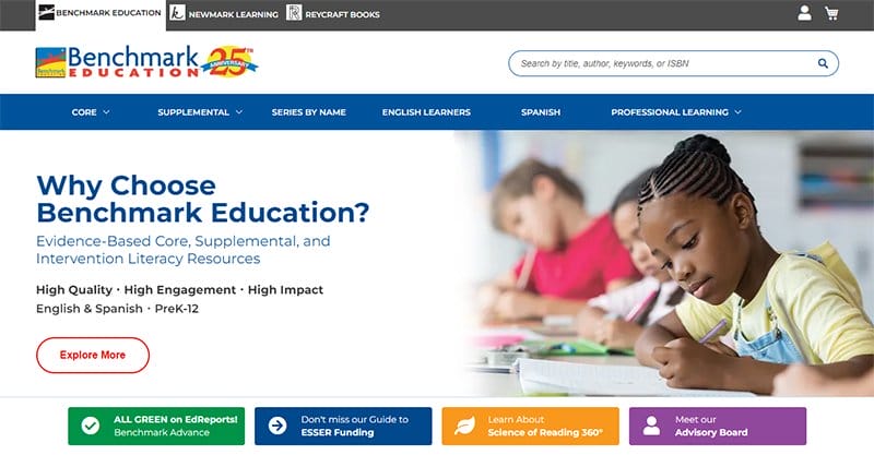
Benchmark Education Company offers online training by publishing high-quality literacy resources that help to encourage language learning and advance knowledge, growth, and achievement.
This web design features a search bar that visitors can use for extensive research about site contents before making any decision.
Parents and potential customers can click the play button at the center of the embedded video to watch content about the school's mode of operations.
I like how this good education website features a two-column design layout to display course content and the overall curriculum.
17. Creative English
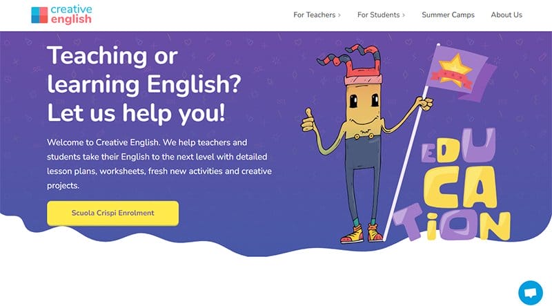
Creative English is an educational initiative that offers high-quality resource libraries filled with lessons, tips, tools, ideas, and inspiration to make teaching and learning fun.
Interested visitors click the blue-colored live chat widget on the right side of the page to reach the school’s customer services representative. The strategic application of eye-catching illustrations in various aspects of the page to clearly describe the site’s content.
Current students can use the newsletter column at the base of the page to submit their details for constant updates about the school's activities.

18. Big Pond

Big Pond is an educational institution that’s committed to the advancement of environmental, economic, and social justice through education abroad.
Welcoming visitors to this stunning homepage is an eye-catching background image of a lady with the caption “Start Abroad and customizable programs in Ireland.”
The hamburger navigation bar is your one-stop shop for exploring various aspects of the webpage without stress before making any decisions.
What’s handy about this webpage is the multiple animated effects in various sections of the site which gives it a catchy and elegant outlook.
19. Beleggers Academy

Beleggers Academy is an investment-based institution that focuses on making financial knowledge fun and accessible so that you can invest with confidence.
This educational website has a colorful design layout with multiple attention-grabbing events that help to give users a memorable user experience.
I like how the page features high-quality images and engaging texts that visitors can check out while exploring the web page.
Clicking these high-resolution images transports you to a separate page where you can get in-depth information about the Beleggers Academy’s activities.
20. Zero to Mint

Zero to Mint brings you the comprehensive information you need to dive into the world of NFTs and own one for yourself. Welcome visitors to the site is a full-width black background with engaging and informative content written in white.
Interested visitors can click the visible seafoam green “Get Started” CTA button to access an informative guide to experiencing what NFTs are all about.
The second button “Skip to Mint” gives visitors access to the mint pixel prize. I like how this minimalist website features colorful content that gives visitors a pleasant user experience.
21. Hope Academy
Made with G oDaddy

Hope Academy’s site falls among the category of the most inspiring educational websites that offer informative content to current students and potential customers.
Visitors have easy access to every page of this fully responsive website via the black-colored sticky navigation bar at the top of the home page.
Current students can access videos, lessons, online courses, and scholarship opportunities by clicking any of the call-to-action buttons on this user-friendly website.
My favorite aspect of this education website design is the automated slideshow featuring visually appealing content that will compel their target audience.
22. The Generation

The Generation Is a one-stop-shop for workshops, scholarships, internships, and career opportunities for ambitious students. I love how the first attention-grabbing element on the site is a white background with the bold caption “Cultivate Opportunity and Discover the Future.”
You can click the noticeable dark blue “Start your Journey” CTA button to explore job hunts, events, scholarships, and other opportunities.
Each section of this educational web page features moving texts, motion graphics, and symbols for easy identification. I love the display of the testimonials section in columns and motions.
23. The KreativePro Masterclass

The KreativePro Masterclass is a virtual reality streaming platform with an exciting project course. Welcoming site visitors is an introductory YouTube video of Nef and a 3D background design with the platform’s logo at the center of the hero section.
Below the hero section, Nef's website showcases awards logos for credibility purposes. The testimonials section is highly gravitating with heartwarming comments.
You can’t miss the seven-column layout displaying courses in a beautiful color scheme for interested visitors to access plus a free course to get started with.
24. HairStyle Academy

The Hairstyle Academy is a high-level barber-hairdressing training services center that offers top-notch services to its clients. Welcoming visitors to the site is a white background with black color text and a “Read More” CTA button for visitors to explore.
Beneath the homepage are three-column layouts of high-quality images displaying hair and hair equipment. I love the display of a client testimonial in a slideshow to inspire visitors.
The “Sign up for Training” section has a free event calendar widget for interested visitors to sign up for the training classes.
25. Wildside Nature

Wildside Nature offers top-notch environmental education to primary and secondary schools and parents. The first attention-grabbing element on the site is a three-slide nature-themed image that paints a picture of the educational system’s mode of operation.
You can't help but love the workshop section featuring a lemon green background that displays images with thumbnail features that give visitors access to its content.
I like the brown tree color background footer that features a yellow CTA button for visitors to have the latest news about the site.
26. Little Dolphins
Made with Webf low

Little Dolphins is a Santa Monica-based multicultural preschool and transitional kindergarten. Welcoming visitors to the site is a large white background menu with a logo at the center and a search feature for easy navigation.
On the homepage is a slider show that showcases content about the school tour. You can't miss the YouTube video of the Little Dolphins tour below the hero section of the site.
I love how the testimonials section contains warm comments to attract visitors. The white ash footer features links, contact, and social media icons for visitors to learn more about the school.
Best Education Websites FAQs
A good educational website contains vital educational-based information for different categories of people across different fields including future students, current students, teachers, parents, and those who want to get a new profession. The site features reliable content that will help visitors navigate the page seamlessly.
Some steps to follow when creating an educational website include designing a framework, creating engaging content, selecting a website builder, choosing a hosting company, brainstorming keywords that will rank high in search engines, designing your website to meet up with all your relevant educational-based contents and setting up Google Analytics.
The top educational institutions with the best website designs include New Orleans Charter Science and Mathematics High School, Bronx Charter School, Typing Agent, Hope Academy, Wonderful Education, Benchmark Education Company, Ivy Stat, Global Swiss Learning, YMCA Scouts DK, Ross School, Little Building Blocks, and The KreativePro Masterclass.
Some of the must-have features of a great educational website include a robust search function. Interesting video feature to tell your story, brand, and visual consistency, mobile and desktop functionality, memorable and attention-grabbing homepage, prioritize customization and personalization.
Explore Further
- Best Education Software Examples
- School Website Templates
- Education Website Templates
- School Name Ideas Generator
- Online Education Website Templates
- College & University Website Templates
- E-learning Website Templates
- Best School Website Designs
- Beautiful Teacher Website Examples
- Tutor Website Templates

Private School Education

Specialized Learning Center

Preschool Learning Center

Preschool Graduation

College Website

IMAGES
VIDEO