
- Book Reviews
- Bookshop.org Shop
- Amazon Shop
- Toggle the search field

Book Review: “The Strange Case of Dr. Jekyll and Mr. Hyde” by Robert Louis Stevenson, Illustrated by Tina Berning
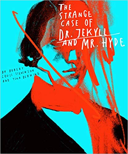
You know the ending even if you haven’t read the book; The Strange Case of Dr. Jekyll and Mr. Hyde, by Robert Louis Stevenson, is such a classic that its biggest spoiler is now common knowledge. Yet, the new Classics Reimagined edition, illustrated by Tina Berning, brings a fresh, modern edge to the well-worn tale.
The story follows Mr. Utterson, a lawyer, who observes the “strange case” of his friend and client, Dr. Henry Jekyll, through a combination of personal experience, second-hand accounts, and various letters. The story opens when Utterson hears about a sinister man who beats a young child in the street and learns that this man is the sole beneficiary to Henry Jekyll’s will. From there, the story is a constant unraveling of oddities and details as Utterson and the reader attempt to puzzle out the connection between Jekyll and this sinister man, known as Edward Hyde. It is a novella; this edition only looks thicker than most because of the added illustrations. It reads swiftly and can easily be finished in one sitting (preferably on a dark and stormy night).
Tina Berning’s illustrations are dark and artistic; they do not attempt to paint a picture (so to speak) of each scene. Instead, they are nebulous tone-setters with vague, foggy outlines of humans and buildings that serve more to set the mood than to detail what the characters and settings look like. For a story as mysterious as this, the style of the illustrations fits perfectly. The artist also does not attempt to recreate a Victorian style; the art has a modern edge that freshens up the old text.
There are many places in this edition, however, that are disorienting (and not in a the-story-is-also-disorienting-so-it-makes-sense way). The illustrator often uses phrases or sentences of text within a full-page illustration to dramatize the words. But these illustrations are not placed within the flow of the text. Sometimes, the sentence occurred a paragraph earlier, and you must re-read the sentence again. Other times, the sentence has not happened yet, so you are confused at the jump in the text. I am no book designer, but I’m sure there is a way to not interrupt the text and have all the words in the correct order. They were able to do this with their edition of The Time Machine , and it was incredibly effective .
Additionally, near the end of the book, the page color switches from white with black text to black with white (and sometimes red, and even sometimes green) text. This may hinder readers who require white-on-black printing to be able to read the text. I have neither vision nor reading disabilities, but even I struggled to read the green-on-black text with ease. It is only a few pages, but no one wants to have to stop reading right at the climax due to poor color choices.
All things considered, I would recommend this edition highly to those who are revisiting the book, but I advise against it for first-time readers due to the often disorienting text and colors.
A copy of this book was provided by the publisher, Rockport Publishers, for review.
Related Posts
Book Review: “Johnny and the Dead” by Terry Pratchett


Book Review: “Vivid” by Jana Jones
Book Review: Sounder by William H. Armstrong
Book Review: House of Dark Shadows by Robert Liparulo
